
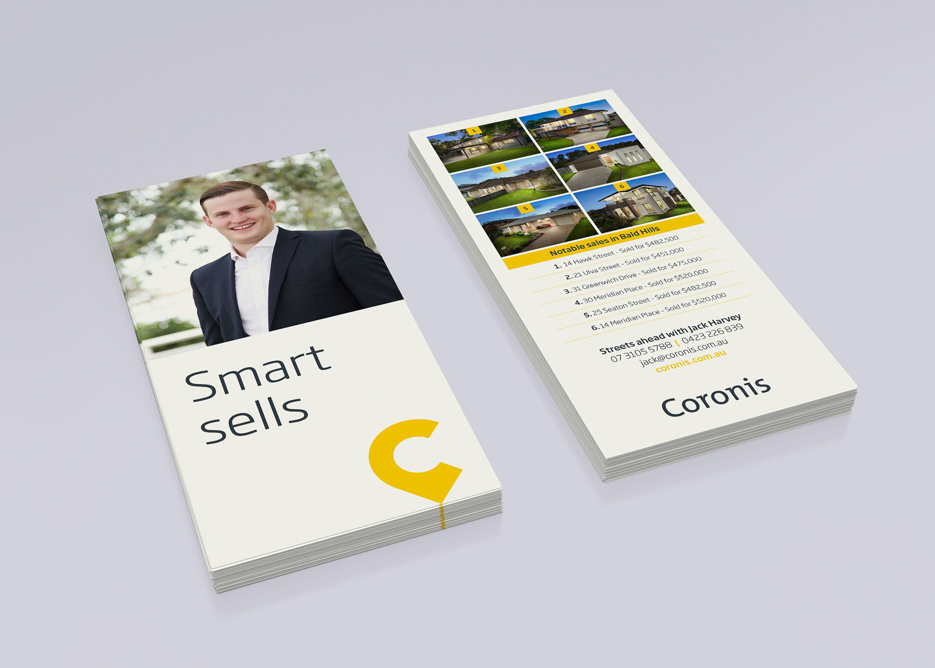
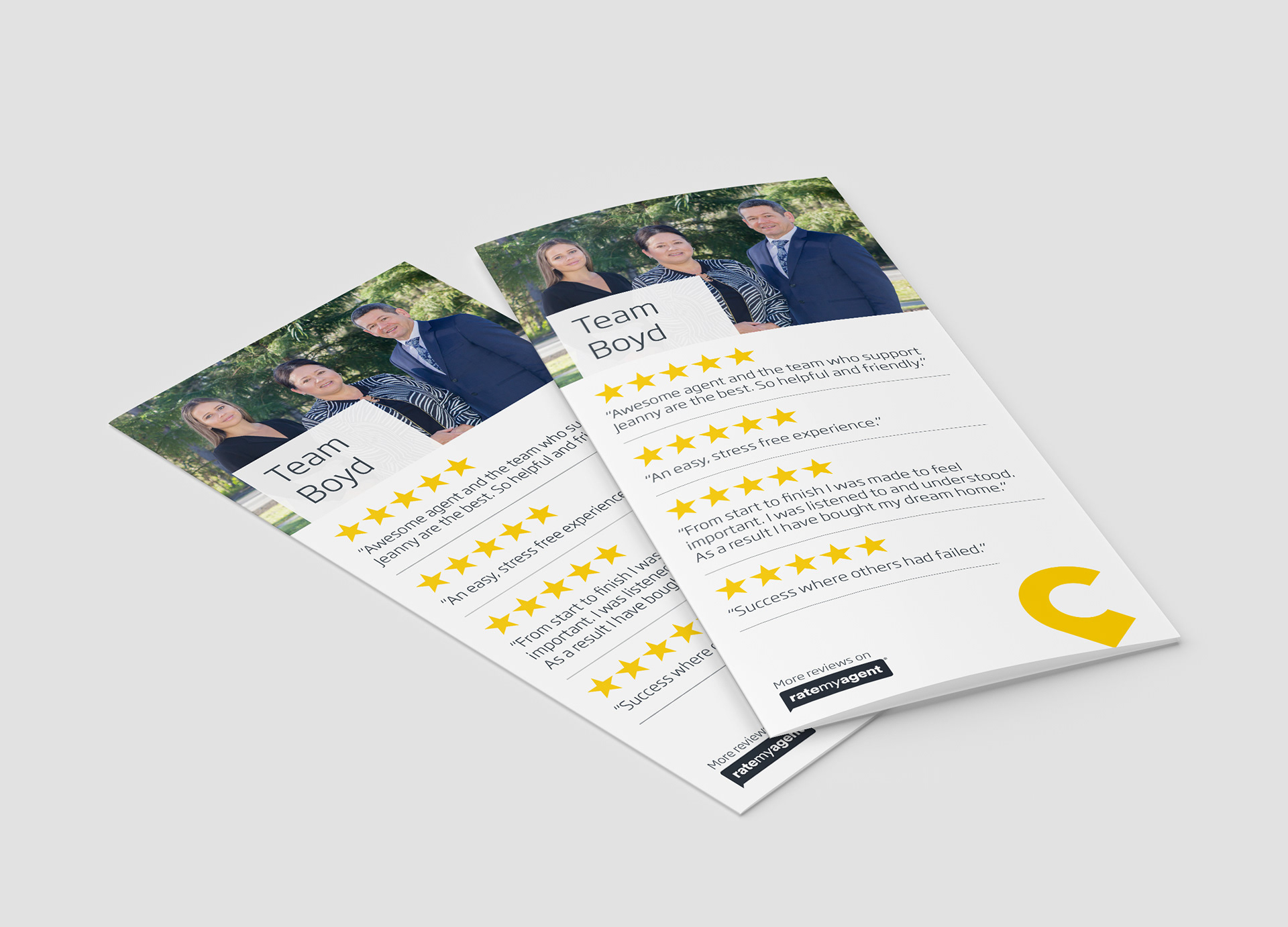
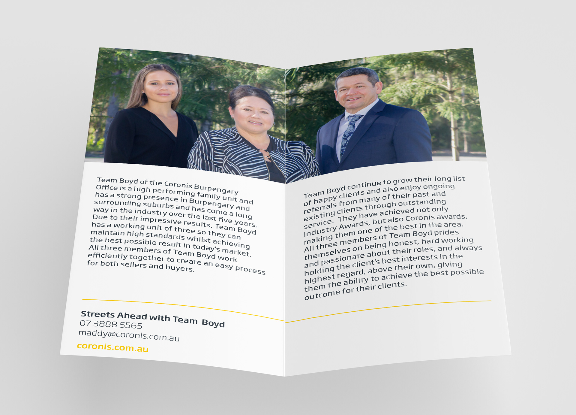
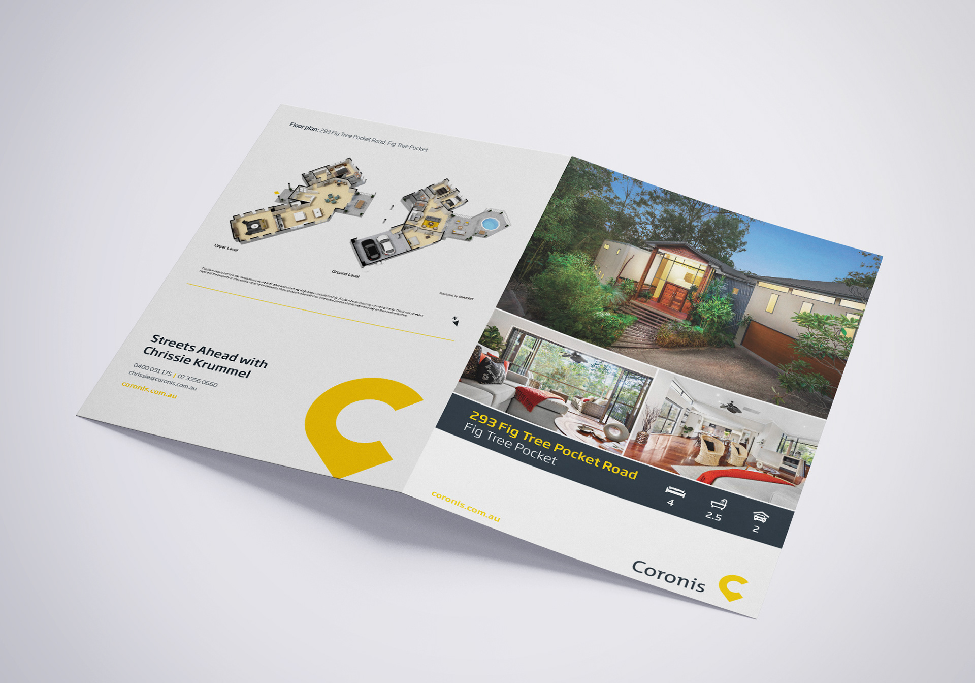
The objective of the Coronis refresh was to make the marketing materials more inviting and to ensure consistency across the brand. The old branding used a very dark palette so to make it more inviting I moved to a lighter look. Also, with Coronis being a family operated business, I changed the imagery to include people where possible. With regards to typography, I have limited the font usage to light and medium weights, and removed all caps headings.